Using visual data exploration for Harvard's research.
Story
Using visual data exploration for Harvard's research.
The challenge.
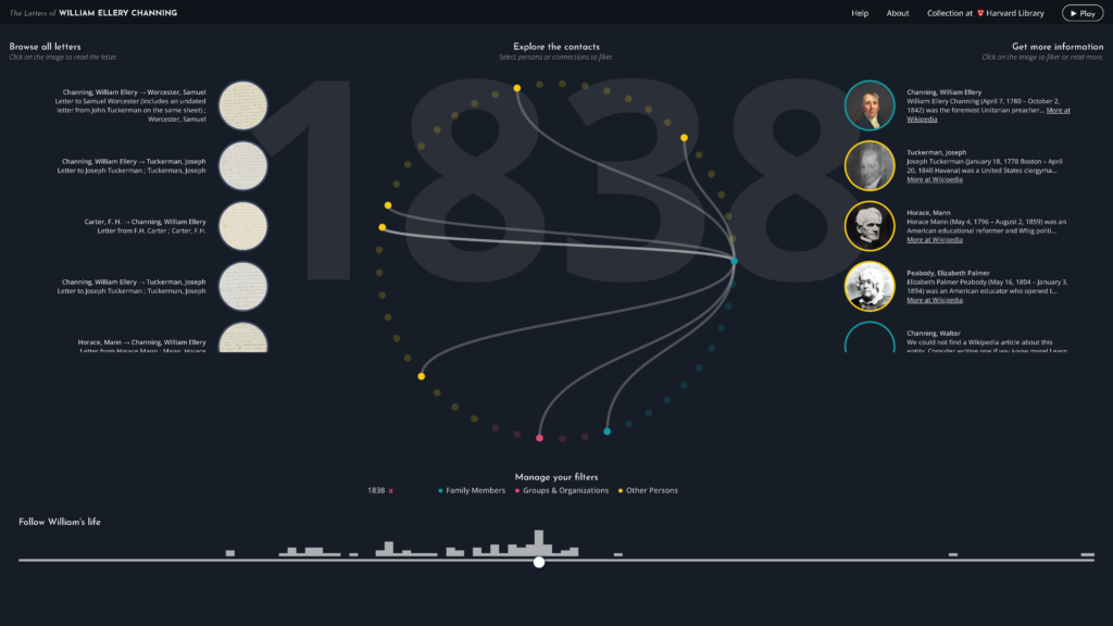
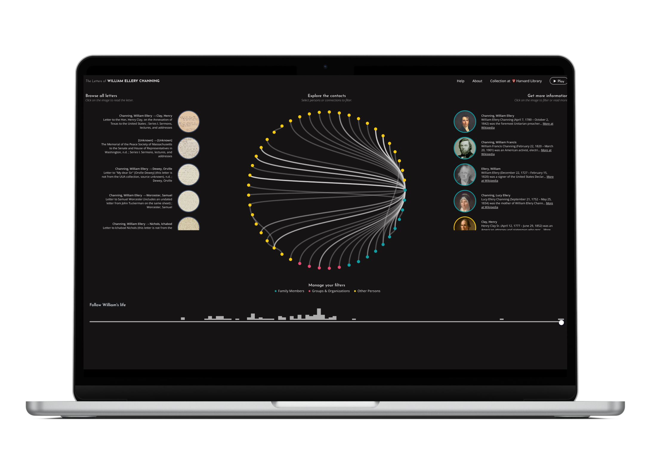
Digital libraries offer vast amounts of documents like letters or manuscripts revolving around personalities, their networks and historic events. The problem: Conventional research tools like library catalogues only provide basic functionality and view on this material.
Wouldn’t it be great to explore all of these documents connected to the persons, time and context they relate to?
The approach.
In a joint project with the User Research Center at Harvard University, we utilized a participatory approach to create the best possible prototype.
Expert interviews: We spoke to leading experts in data visualization from Harvard, Google, and award-winning design agencies to find out what makes good interactive visualizations.
Participatory Design: In interviews with the target group, we created > 100 concrete design recommendations, criteria and a focus for the research tool with future users as the driving force throughout the process.
Implementation: With the JavaScript framework D3.js, I developed an interactive web-based data visualization that adjusts according to parameters like time and related persons.
Got stuff done.
An award-winning research tool based on interactive data visualization.
The results.
“The Letters of William Ellery Channing” enables researchers to interactively explore a digital library collection, and integrates several crucial research features as well as a digital document viewer. Not only was it awarded with the b.i.t.online Innovation Award, but users agreed that the tool is useful and efficient.
This tool shows that including users in early design phases is not nice-to-have, but crucial to the success of complex products like the ones in the public sector and that investing in the processing of available data pays off.